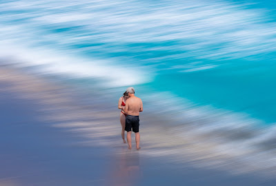
Same photo.
Same steps in editing.
The only difference is the use of the clarity, white, and saturation keys. Which changes some of the coloration as well the softness.
Say.....which one is more appealing to you.
Or......
You can even say.....neither .....don't like the edit.
All suggestions are definitely welcomed!
By the way, the style of edit is a take off of Tomas Fotomas. You can see some of his photos here.


Not so much difference between them. Would go for the first one.
ReplyDelete😊
DeleteIf I had to pick one then probly the last but its not really an edit that does a lot for me
ReplyDelete😉
DeleteI really can't tell much difference between them. (I have a bit of red-green colorblindness, so I'm not a perfect judge of this.)
ReplyDelete😉
DeleteSince all three of you were saying the same thing...almost, I shall respond as a whole. The way I see it.... the first one is very subdude, colors are soft as are the two humans...not very sharp. The second photo I boosted the white causing the "white caps" to be more white and the humans more bright. The last photo was a tad darker hence the blues more blue and the humans less soft, rather too sharp, boosted the clarity. To me while the differences were minimal, the blending of as a whole is what made the difference. And Peter Smith you and my husband seem to be in the same boat.... 😁😎
DeleteAt least I am in good company. I hope😁
DeletePeter, you're safe 😉
DeleteI think the contrast in #3 is much better - the darker color between the beach and the deeper water is really highlighted by the sandy strip in between.
ReplyDeleteTo be honest the deeper color was my first choice but the more I looked at the photo the less I liked the people...their color and sharpness didn't seem to match ( in my mind) the softness of the water and sand.
DeleteThanks Tom for the comment. I am torn between one and two.
ReplyDeleteSorry for this rather late comment, Camellia. I had meant to write earlier but was unable to find a peaceful time to observe your photos. Personally the photos looked fine and what makes it a bit slightly "off" for me was the couple - smacked right in the middle. I do not know if that is your main view but I think it does not work quite well. It would be a bit more balanced if you 'move' the couple towards the right and leave more 'negative' space for the waves, sea. This is only my point of view and I might be wrong.
ReplyDelete